Tuesday, February 28, 2006

Drum Sequence

Click on any of the photos to see a larger version.


Monday, February 27, 2006

Of camera gear and dreams

The Photo Marketing Association (PMA) is conducting its convention and trade show in Orlando, Florida, this week. Enthusiasts and brand loyalists, hungry for news or rumors, monitor the internet for weeks before this annual event, the largest of it's kind in the United States. (The largest in the world, Photokina, convenes every other year, with the next Photokina scheduled for this September in Cologne, Germany.)

Photography forums on the internet already abound with PMA-related messages. These messages can be filled with much weeping and gnashing of teeth (when, for example, one group's favorite brand announces a new camera that falls short of the hoped-for number of megapixels) or the messages can be wildly exuberant (a group celebrating because their brand has announced a new model, stuffed with innovative features, that seems to have caught the stunned competition off-guard).

Future entries at Variable Focus will contain more observations on pieces of camera gear and the "gearheads" who love them, but today seems like the perfect time to offer a photographic representation of one photographer's dream camera. Please click on the photo to see a larger version. You will want to read closely as you review the functions of the various dials and buttons.


Sunday, February 26, 2006

Four Photographs for a Sunday

Click on any of these photos for a larger version.


Saturday, February 25, 2006

Earthframes

Uwe and Bettina Steinmueller are husband and wife, photographers, and proprietors of Digital Outback Photo, an eclectic web site that offers a good balance of photographs, equipment reviews, and software reviews. They are also authors of California Earthframes, a book that features 78 of their photographs made during the last five years. The term earthframe indicates a photo that is a detailed, sometimes abstract, study of nature. The book is not at all just close-up work, however, as it also contains wider photographs of lovely sweeping vistas, including both landscapes and waterscapes. The Steinmuellers have an eye for soft, muted colors, and for soothing lines and patterns. For a relaxing viewing experience, click here to see a portfolio of 20 of their California Earthframes.

Some other items at their web site might also be of interest. They announce Portfolio Invitation themes, attracting submissions from their photographer/readers who then proceed to vote and identify favorite photographs. These portfolios are generally of high quality--and if you enjoy some of the current work on display, you may find yourself clicking backward into the past to review some of the previous portfolios. A link to Digital Outback Photo site has been added (top right of this page) to the Variable Focus list of recommended links.

Friday, February 24, 2006

Dr. Harold Edgerton

Chances are that most of us have seen a photograph made by Dr. Harold Edgerton, but chances are also good that most of us did not know--or remember--who made the photo.
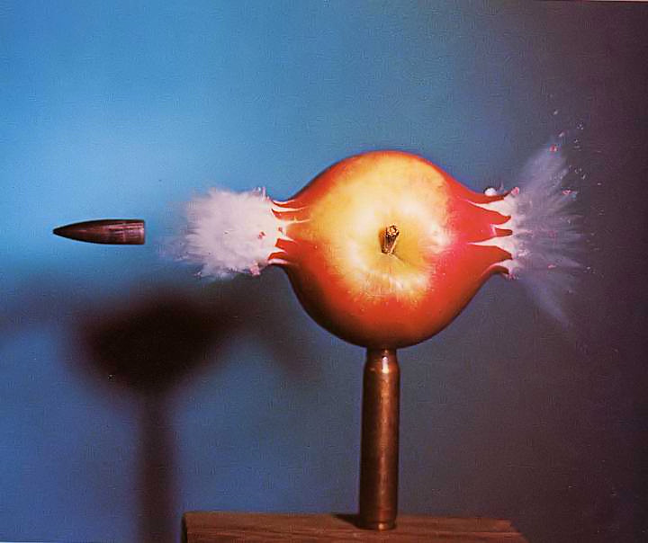
Edgerton, born in 1903, was a professor at the Massachusetts Institute of Technology (MIT) in 1931 when he developed a flash, or stroboscope, for use in high-speed, stop-action photography. Utilizing an open shutter, moving film, and a flash that strobed many times per second, be captured images of an unseen world.

His popular images showed a coronet created by the splash of a milkdrop, a football compressed by a kicking shoe, and a bullet firing through an apple. Edgerton also invented flash equipment for underwater use by Jacques Cousteau. He died 1990.

One disturbingly beautiful set of images Edgerton made was a series showing a nuclear test blast in the instants after detonation. Using a camera positioned seven miles away, the shutter speed was 100 microseconds. It is oddly ironic that this image of death also suggests the look of a single-celled organism seen under a microscope.

Photos by Edgerton:


Thursday, February 23, 2006

Scenes from a Railcar Graveyard

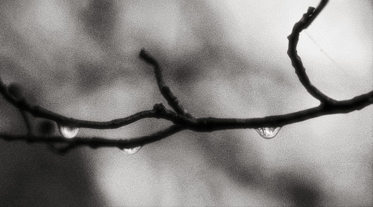
A few splashes of color on a dreary winter's day.

Click on any of the photos to see a larger version.


Wednesday, February 22, 2006

Reality, illusion, and interpretation

As mentioned in previous entries, making a photograph implies the weighing of a number of decisions. Some expert photographers are so adept at the craft that they make the decisions rapidly, almost subconsciously, eliminating elements that will distract the viewer as they select the lens, angle of view, aperture, shutter speed--sorting through all these possibilities and making choices that will contribute to the ultimate, desired effect.

Other photographers (the "intermediates") work through all of the same decisions, but slowly and methodically. The intermediates make many beautiful photos, but typically their knowledge has so far made its way only into their brains and not yet into their bones. Thus, they are not confident, and their percentage of good photos (hit rate) is likely to be less than that of the experts.

Many or most snapshooters consider none of elements that contribute to a photograph's effectiveness. They fire away, sometimes with surprising results. Just as do the experts and the intermediates, the army of snapshooters makes many strikingly good images, but their success is almost entirely a hit-or-miss proposition. In photography as in many other endeavors, Lady Luck is a wonderful companion, but she cannot always be trusted, having the annoying habit of disappearing at the most inopportune times.

Michael Reichmann has posted an essay at his web site, The Luminous Landscape, that deals with his creative process in making a photograph. Beyond the elements mentioned in the paragraphs above, he also deals with ethical considerations of removing objects from a photo, and how post processing a photo on the computer has become part of the chain of decision-making.

One very nice feature of the piece is that Reichmann is willing to show both the before and after. In addition to the final rendering of the scene, which reflects his artistic choices, he also presents the raw, unedited, original frame that he exposed. As the title Lifting The Shroud implies, the article provides a window into one photographer's way of seeing.

Tuesday, February 21, 2006

Grain.......or not

When film was king, grain was a side effect of the film process. Silver halide crystals were the film's photographic medium. The finer the crystals on the film, the finer would the appearance of grain in the negative. (For simplicity here, we leave aside variables such as under- or over-exposure, or which chemicals were used in processing.) Conversely, the coarser the crystals, the grainier the negative would appear and, thus, the grainier the print.

With the advent of digital photography, grain was replaced by a different phenomenon and a new term--noise, the evidence of electrical interference when the activity of one photosite (pixel) overlapped with an adjacent photosite. Photographs made at ISO 400 with a film camera contained much less grain that the noise present if a digital camera made the same exposure set to ISO 400.

Electronics advances rapidly, though, and soon digital photography began beating film at the grain/noise game. Consumer digicams, while improved, continued to have significant noise at ISO 400. However, more expensive digital SLRs, featuring larger sensor chips containing larger pixels, began to produce photographs at ISO 400 that contained much less noise than the comparative grain in a film exposure made at ISO 400. Soon ISO 800 became usable, then 1600. Very good digital cameras not only allowed photographers to make "clean" photos at high ISOs, when shot at lower ISOs such as 200 and 100, the digital cameras produced exposures that were virtually noise-free, the equivalent of what a film photographer from past decades might expect at ISO 25 or 50.

Then, as they say, "a funny thing happened," particularly with black and white photographers. It had become quick and easy to convert a color digital photo to black and white, but to the eyes of many photographers, the photos looked too smooth. They lacked a certain character that had been synonymous with black and white. The solution? Just as software could be used to convert a color original to black and white, software could be used to add the appearance of grain. Many photo editing programs include this feature, and some (including one wonderfully named Grain Surgery) exist solely to perform that task.

Future generations may look back on the business of adding grain to photos as a obsolete, quaint activity that was part of the transition from film to digital. Or, rather than universally adopting a smooth look in photographs, they might decide that grain affects texture and, to some eyes, the illusion of sharpness in a photograph.

Below, two versions of the same photo, the first as-shot, the second one with grain added. What do you think?

Following those, a photograph shot and processed to strongly emphasize the appearance of grain.


Monday, February 20, 2006

A photo vision checkup

Most people see photographs on the internet much the same as everyone else seems the same photos, right? Well, yes and no. Currently, no standards are sufficiently widespread to ensure that any user's computer will have brightness, contrast, hue and saturation set to match anyone else's computer. Not only that, as the light changes in the room that houses your computer, you yourself may not being seeing a photo in exactly he same way today as you viewed it last night.

Measures to address this situation can become quite involved and very, very expensive. Hardware calibration tools that attach to a monitor and measure its output are available for hundreds of dollars. Software-only approaches also are available, although photo-editing purists will point out that any approach that depends on software and eyeballs is not as accurate as an approach that incorporates hardware and software.

Fortunately, exactitude in this area might be something to aspire to, but it is not required. For most users, close is close enough. However, do not be content in assuming that your monitor is working in the "close enough" range. Many are the stories of those who came to realize that what they were seeing was drastically unlike what others were seeing.

Brightness and contrast are particularly important when viewing photos, for they control highlights and shadows. Photographers often devote considerable attention to metering and exposing for these. Sometimes the preferences is for "open" shadows, areas that, although dark, still contain detail. Other photographs will intentionally contained closed or blocked shadows, intentionally obscuring detail and helping to move the eye of the viewer to another part of the photo. A photograph's overall brightness or darkness (a characteristic known as its gamma) also plays an important role in conveying atmosphere and mood.

A number of calibration checks are available on the net, but one that is free, simple and effective is located here. You might find that no changes to your monitor settings are needed. Or you might be in for a surprise. While you're at that site checking you monitor's calibration, also look at the gallery of color photographs of the University of Cambridge. The photographer's handling of some dramatic, challenging lighting is impressive.

Sunday, February 19, 2006

Photojournalism as Art, Part 2

(To review Part 1, scroll down to Wednesday, February 15.)

Contemporary photography has continued the tradition of practitioners whose work serves journalistic and documentary purposes, and at the same time could be displayed as fine art in the most prestigious photo galleries. David Douglas Duncan made famous photographs of World War II and the wars in Korea and Vietnam. In much the same tradition, Donald McCullin gained notoriety for gritty black and white portrayals of wars in Cyprus, the Congo, Vietnam and Biafra. Steve McCurry, who works in color, has made photographs around the world, many of them on assignment for National Geographic magazine. He is the author of the iconic photograph Afghan Girl (right).
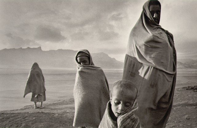
SebastiĆ£o Salgado is a Brazilian, educated in economics there and in Paris, whose work in Brazil and in England eventually took him to Africa as economist for an international coffee organization. At that time he began serious work in photography. Since then he has captured images of famine in Africa, manual labor in open-pit Brazilian mines, the migrations of peoples around the world, and a global effort to eradicate polio. His photography is entirely in black and white. During one seven-year period, he photographed in 39 countries. The example below, from 1984. shows refugees in Korem, Ethiopia.

James Nachtwey is perhaps the best-known of present day war photographers. He has documented conflicts in Latin America, Africa, Asia and the Middle East. The winner of many awards, Nachtwey was featured in the 2001 documentary film War Photographer. Many scenes in that film were captured with a small video camera mounted above the viewfinder of his still camera, giving the audience a photographer's-eye-view of Nachtwey's often dangerous work. The example below, however, runs almost contrary to type. The gauze of dust and the girls' colorful dresses create a beauty that contrasts their precarious situation in 1984 El Salvador.


Photographers such as Salgado and Nachtwey are often the subject of criticism from different, sometimes-contradictory, directions. When their photographs show intense suffering, even carnage, the photographers are accused of engaging in a kind of visual pornography, concentrating too much on the awful, sensationalistic cruelty that they exhibit. Yet when the photographs primarily show nuances of light and shadow, line and texture, the photographers are subject to criticism that the photos are too artsy, and that they make a kind of beauty out of horrors that should not be diluted. Certainly the photographs do show a wide spectrum of the human condition. The people who make the photographs are unusually able to be. simultaneously, skillful craftsmen, detached enough to do the mechanical work of making photos, and sensitive artists. Most of them are dedicated to making images that might help to bring about an end to the conditions they portray.

A very recent example of photojournalism that does not gloss over the harsh reality of war in Iraq is Unembedded. To create the resulting book and exhibition, four independent photojournalists and three filmmakers worked outside the auspices of the U.S. military. The project depicts the situation for fighters on both sides, as well as for the civilian population. Be aware that many of the photographs are quite graphic. The link to Unembedded is here.

Salgado is one of the photographers featured at the Masters of Photography site (in the list of links, above right). Links to the work of other contemporary photojournalists are here:

Saturday, February 18, 2006

A radiant tutorial on composition

As mentioned in the February 15 entry on photojournalism as art, analysis sometimes cannot say entirely what it is that makes certain photographs so evocative. Masterworks particularly seem to communicate at some intuitive level, and the effect becomes almost ineffable. At such times it is best to look and to be silent. (In much the same way, this phenomenon is similar to what happens when someone tries to explain why a particular joke is funny. The explanation is always decidedly unfunny, and the effect is ruined.)

That does not mean, however, that basic principles of composition cannot be identified and taught. Will studying composition somehow stifle a person's innate, creative power? Perhaps a case can be made for that. Conventionality probably has hindered some unconventional talents, and Ansel Adams is one example of how avoiding a formal education had a positive outcome. Most photographers, however, can benefit from considering composition. As a painter once said about art lessons "If you're a genius, they probably won't hurt you. And, if you're not a genius, they probably will help."

A relatively new web site, Radiant Vista, has posted a multimedia tutorial on composition (link here). [Be aware, though, that this is a download of a QuickTime .mov file that, with a broadband connection, takes a minute or so to get started. If you don't have a broadband connection, the wait will be long.] The tutorial runs for almost 18 minutes. To its credit, it takes the practical view that the "rules" are guidelines, not chains intended to enslave.

Hearing ideas explained while seeing them illustrated visually can be an enjoyable experience. Radiant Vista also has tutorials in .pdf format, as well as audio files ("podcasts"). The site posts daily critiques (again QuickTime movies, but much shorter than the tutorials) of photographs submitted by readers. Some of the tutorials about photo editing are specialized, and some of the daily critiques are less insightful than others, but Radiant Vista has enough of general interest to prompt its addition to the list of links (top right) here at Variable Focus.

A reminder. If you know of a web site of interest to those who make photographs and for those who enjoy photography, pass it along. You can provide your own mini-review if you'd like, although that's not necessary. Scroll down to the introductory entry of Monday, February 13, to find the procedure and an email address.

Friday, February 17, 2006

More photography in the news...

With a restraint achieved with great difficulty, the following two items are presented without comment.

Cell phones at funerals. Reuters begins in a short feature story with this: "Japan's obsession with camera-equipped mobile phones has taken a bizarre twist, with mourners at funerals now using the devices to capture a final picture of the deceased." The story closes with this quote from someone identified as a social commentator: "Some can't grasp reality unless they take a photo and share it with others."

Curling changing its image. Female Olympic curlers from Italy, Denmark, Spain, Britain, Poland, Germany, Austria and Canada have posed for a nude calendar. The photographer who designed the project is Ana Arce, a former member of the Andorran women's team. Proceeds go to the national programs of the participating models. Although the calendar has been on the market for a few months, the project is in the news today because of an Associated Press story. Various other reports indicate that the black-and white-pictures (some of them, at least) are of artistic intent. As a public service, Variable Focus located a story on-line that includes a sample photograph. If you wish to learn more, you can click on this link.


...and an unrelated photograph.

Drip

Thursday, February 16, 2006

A record-setting sale

Whether you're using the most humble point-and-shoot camera or the latest multi-megapixel monster, you might want to keep clicking that shutter. A 1904 color photograph made by Edward Steichen recently sold at auction for $2.9 million.

A pioneer in early color work, Steichen's best-known images were made in black and white. These included advertising and commercial work. As a magazine photographer, he also produced portraits of celebrities during the 1920s and 1930s.

Steichen was the influential curator of photography at the Museum of Modern Art in New York from 1947 to 1962. His most noted accomplishment in photography came while in that position, in 1955, when he organized the large exhibition (and book) The Family of Man.

More information about Steichen, and samples of his work, can be found at the Masters of Photography link (top right) on this page.

For a look at The Pond-Moonlight, the photograph that set the photo auction record, see the story (link below) at the BBC News site.

http://news.bbc.co.uk/2/hi/americas/4715106.stm

Wednesday, February 15, 2006

Photojournalism as Art

Every photograph is, in a sense, an editorial act. Even the simple and casual snapshot involves editorial decisions. The photographer points the camera from a particular angle, and, at that moment, all other angles are excluded. The photographer determines how close to stand to the object being photographed, and the photographer determines whether to fill the frame with the object or perhaps to back away and include more of the background. The photograph, then, can be used to see objectively, but it always sees selectively.

Pictures (paintings as well as photos) prompt us to react by stimulating us in various ways. Content, certainly, is one factor. Similar portraits of an anonymous man, or a former president, or a deceased grandfather will affect us differently. We also react differently, whether aware of it or not, based on the technique that was used in making the picture. Van Gogh's stars might be the same stars pictured by the Hubble telescope, but there is a world (or a galaxy) of difference in what we see, what it makes us think, and what it makes us feel.

Many early photographers worked to make their photos mimic the appearance of paintings. Paintings were, after all, artistic. Cameras with lenses that focused softly, and that were pointed, for example, in the direction of natural scenery, could produce pictures that were similarly artistic. At the same time, the ability of the camera to render photos that seemed much more realistic fostered another strain of photography. Along the way, photorealistic depictions replaced wood and steel engravings. Photojournalism emerged.

Mathew Brady and associates covered the Civil War. Lewis Hine documented the conditions of the working class. The Farm Security Administration's photographic project showed the U.S. 
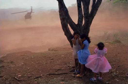
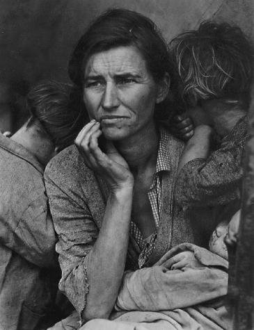
Congress, and the greater U.S. population, the devastation of the Depression (see, right, Dorothea Lange's iconic Migrant Mother). Walker Evans recorded both rural and urban America. Robert Capa captured World War II, and Alfred Eisenstaedt showed the world life before, during and after the great war.

These photographers made images, sometimes, that transcended the simple mission of reporting. Through perspective, the use of light and shadow, and other technical talent, they made a number of photographs that stand as art. How and why do these photographs have such effect? Geometry is at work, of course, and books and articles do exist that show pictures simplified to lines, circles and triangles, and which discuss the arrangement of these in space and why they appeal. Ultimately, though, the explanations are not entirely satisfactory. Analysis explains partly, but not entirely.

Consider, for example (below), Henri Cartier-Bresson's photograph of the painter Matisse. Cartier-Bresson became known for recognizing how the elements of a photo could ideally come together in one concentrated, decisive moment. This is a classic example of an environmental portrait, one where the setting reveals something of a person's character. The artistic and editorial skills of Cartier-Bresson determined exactly how much to include and how much to leave out.


Another photographer whose work combined the instincts of journalist and artist was W. Eugene Smith. See, for example (below), his passion, and compassion, in The Wake, a photograph of a family gathered together to mourn the death of a patriarch. Obviously, though, more than an intense impulse of feeling was at work in making the photograph. The arrangement of the faces represents a perfect kind of balance, and the interplay of the dark tonal values with the light is captured expertly.


In the works: Contemporary examples of photojournalism as art.

Tuesday, February 14, 2006

The Color Red in Winter


Variable temperatures across the U.S. this Valentine's Day.

Monday, February 13, 2006

An Introduction

Having verified that all blog settings are correctly enabled to display text and graphics...

Greetings and welcome to Variable Focus. Here you will find news, commentary and examples concerning photography. As the name implies, however, a variable focus can include more. Reviews of books about photography, discussion of cinematography, even full-blown movie and book reviews--all are within bounds. Reader submissions are welcome and encouraged (more about that will follow below). What falls outside the boundaries? Probably those limits will be determined by your benevolent editor as they are tested. The subject of still photography, whether traditional or contemporary, is the starting point, but any discussion of what's good in the visual, performing or literary arts will be at home here.

How to contribute. Whether it's a news item, a link to another site, a brief article, a detailed essay, or a digital photograph, if you think it might be of interest, we (the editor and various assisting elves) would like to see if it has a place at Variable Focus. Please be aware, however, that this blog is a moderated forum. If you'd like to originate a post, send it to the encoded address: abcdefg@hotmail.com. Of course, that address, as it appears in the previous sentence, is a fake to ward off automated spam bots. In place of "abcdefg," substitute the words "jim_natale" and your email containing your submission will be on its way. (Note the underscore between jim and natale.) Be sure to put Variable Focus in the subject line so that your material is reviewed promptly.

In the works: Observations on photojournalism as art.

Sunday, February 12, 2006

Garden Path

Trial post

Testing...testing...testing...1, 2, 3...smile...