Friday, March 31, 2006

Nick Nichols

In many photographic circles, working as a National Geographic photographer is considered a pinnacle of the profession. Working as a full-time Geographic photographer is perhaps even more of an elite position than most photographers imagine. The magazine employs only a small number of full-time staff photographers. Many, probably most, of the photo assignments are handled by freelancers. One of the magazine's staff photographers, Michael "Nick" Nichols, has a terrific web site, full of visual material, of course, and also containing interesting short essays about the work (hard) and the preparation (extensive). Nichols also provides plenty of photographic advice and opinion, a reading list, and links to other relevant web sites.

Nick Nichols has a photographic resume that includes work as an assistant to Life magazine photographer Charles Moore, a job and a contact that helped him to get magazine work. By odd chance--and something I discovered only after I knew of the work of Nick Nichols--his first course in photography was at the University of Montevallo, which is 1) a small, public university south of Birmingham, and 2) also my undergraduate alma mater. Small world.

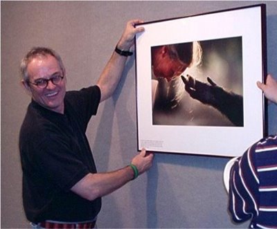
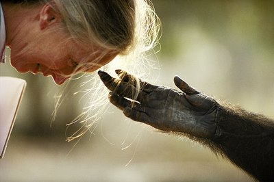
Probably the photograph most identified with Nichols is one he made of Jane Goodall. He is pictured with a print of it below (first photo by Christy Pepper, Alabama Public Radio).


Take some time to enjoy his web site, and you will be well rewarded. Find it by clicking here.

Also, Nichols comments on the making of the photograph and other aspects of his career in an audio interview that you can find here.

Nichols is motivated by the mission of making photographs that "can speak for things that can't speak for themselves." Viewing his work, and reading and hearing his words, you'll encounter a photographer who has achieved a balance between the world inside the camera's rectangular viewfinder and the larger world outside that frame.

Thursday, March 30, 2006

Eclipse Shadow from Space

You've probably seen photographs of yesterday's total eclipse of the sun. Or you've seen photos of other eclipses. There's also a good chance, in this internet age, that you've seen a satellite photo of earth at night, showing city lights ablaze.

Here's something of a combination of the two--and a different twist on conventional eclipse photos. The picture was made from Expedition 12, the international space station. The dark area is, of course, the moon's shadow passing over the earth in daylight. The island at the top of the photo is Cyprus in the Mediterranean Sea. To the left is the coast of Turkey.

While it is impossible to say how many photos were made of the eclipse, we can be sure that not many photographers were able to shoot from this angle.

Wednesday, March 29, 2006

Top of a World

Tuesday, March 28, 2006

Greenhouse Door

Monday, March 27, 2006

An underappreciated photographer

Look through the Masters of Photography web site and you won't find the work of Eliot Porter. Chances are you also won't find him listed at other, similar sites. Porter (1901-1990) was a medical researcher turned photographer who produced a number of books that were popular in their day (the decades of the '60s, '70s and '80s). He did not receive widespread critical acclaim, however, almost certainly because he was one of the first to do serious, fine art photography in color.

Color photography and black and white photography have distinct strengths and they often convey ideas and emotion, quite effectively, in vastly different ways. Whether or not both enjoy the same level of acceptance in the art community remains open to question. During the time of Porter's career, though, it is safe to say that color was the stepchild, while the traditional monochrome print was seen as being more artsy.

Perhaps the combination of a scientific background and his position as a pioneer in color photography contributed to the style of Porter's color work. Much of it is interested in fine detail--flower petals, leaves floating in pools, lichens on rock, for example. A concern for the ecology is obvious throughout.

After you have a look at the samples below, continue reading. There was more than this to the artistry of Eliot Porter.


Although best known for this color work, it was as a black and white photographer that Porter first came to the attention of the influential Alfred Stieglitz during the 1930s. Beginning in 1946, Porter lived in Santa Fe, New Mexico, and many of his best black and white photographs picture the American Southwest.

Not many photographers can move from one style to another as gracefully as Porter was able to do. With an amazing versatility, some of his black and white photographs compare very favorably with the work of Ansel Adams, Walker Evans and Edward Weston. Here is a sampling:


Porter left his professional work to the Amon Carter Museum in Fort Worth, Texas. See the link below for their excellent on-line collection and guide to his work.

Sunday, March 26, 2006

Hairspray

Saturday, March 25, 2006

Spring Tulip


As you are very likely to know by now, click on the photograph and you will see a larger version.

Friday, March 24, 2006

Morning Solitude


(Blogging software creates jpeg compression artifacts when reducing the size of this photograph. Click on the photo to see a better, larger version.)

Thursday, March 23, 2006

TONY'S TERRIFFIC - Hot Dogs & Sandwiches


Click on the photo to see a larger version.

Wednesday, March 22, 2006

Leaves Lit By Light


(Click on photo to enlarge.)

Tuesday, March 21, 2006

(One Way) or another

Monday, March 20, 2006

One Way

Sunday, March 19, 2006

Pictures of the Year

Many fine selections of photographs are featured each December (and January) in year-end retrospectives. However, one of the oldest and most prestigious contests concludes every year in spring. For 63 years, the Missouri School of Journalism at the University of Missouri has named the Pictures of the Year International (POYI) winners. This year 39,000 photographs from 45 countries were entered. After 19 days, a panel of 12 judges had selected winners in 46 categories. Barbara Davidson of the Dallas Morning News was named Newspaper Photographer of the Year, and Tamas Dezso, a Hungarian freelance photographer, was named Magazine Photographer of the Year. Examples of their work:


The winners' galleries at the POYI site are a treasure trove for photo lovers. Samples include work in nature photography, general and spot news, feature and sports photography. Single and multi-photo stories are highlighted, including magazine portfolios that demonstrate that the magazine photo essay still thrives, even if less visible than it was in the glory days of Life magazine. New technology is represented by a multimedia section that features photography published via internet slide shows.

You can link to the FOYI winners gallery and find yourself spending considerable time looking through a dazzling collection of work, not to mention archives from previous years. First, though, a few other favorites.


And now the link: Winners Gallery, Pictures of the Year International. Recommended viewing.

Saturday, March 18, 2006

The Depression...In Color

Almost any survey of the history of photography in the United States will make note of the Depression-era photographs made under the auspices of the Farm Security Administration (FSA). The photos were timely, as they influenced the U.S. Congress to support New Deal legislation. Longer-term, historically, they have shaped the world's collective memory of the Depression. The economic devastation that afflicted the land is mirrored to this day by the FSA's stark, black and white images. A classic example is Arthur Rothstein's Fleeing a Dust Storm.


FSA photographers made more than 160,000 such images. Many of them, such as the Rothstein photo and Dorothea Lange's Migrant Mother (see the Variable Focus archive for the entry of Feb. 15), are quite well known. Not so widely known are the 1,600 color photographs made by FSA photographers.

For the most part, photography reflects history rather than makes it. The poverty and hunger of the Depression years would have been crushing no matter how they had been pictured. But our collective memory is, perhaps, another matter. In our mind's eye, we see a Depression as Rothstein and Lange captured it, not a Depression that looks like this, as captured by photographer Alfred T. Palmer:


The picture could easily fit as an image from The Grapes of Wrath, but, as we have seen in other examples, color conveys an atmosphere far different from that of the moody, monochrome John Ford film. Perhaps, in a sense, the color even alters the message of the John Steinbeck novel or a nation's memory of a decade of hard times. It is a question that can be considered at length.

Meanwhile, to see more documentary photos from that era, here are links to the FSA black and white photographs, the FSA color photographs, and a quick slideshow of the color photos from the book Bound for Glory.

Friday, March 17, 2006

Green Boat

Thursday, March 16, 2006

Red Boat

Wednesday, March 15, 2006

Converting a color photograph to B&W

Someone recently requested information on how to convert a color photograph to a black and white version. As with many questions, formulating an answer depends heavily on the what the questioner brings to the moment. We've probably all been in spots where, when asked a question, we give the preliminary response: "Do you want the long answer or the short answer?"

Discussions of how to do something can become intricately detailed, but today we will go with the short answer. If you are an old hand at using photo-editing software, this quick and easy example probably will seem elementary to you. However, if you're a newcomer to this technique, or if you're using another method and you are not quite satisfied with its results, you may find that producing a black and white photograph with that certain "look" you are seeking is within reach.

Let's begin with a color photograph.


Not a bad example of candid, street photography, but the photo is not without its problems. The emphasis should be on the expressions of the people in the foreground, but the background contains some colors that distract attention away from the people. That makes the photograph a good candidate for conversion to black and white.

Digital camera buyers usually find some photo-editing software included when they unpack their cameras. When the time comes to make a black and white photo, the new camera owner opens a color photo into his photo-editing software, clicks on a command with a label such as "desaturate the photo," or "change to grayscale," and (drumroll) the result pops up on the screen as..........blah, a dull, rather lifeless version of the photo. What went wrong?

The problem is that one size does not fit all. The pre-packed settings will produce a marvelous result sometimes, but the possible range of colors in photographs makes it impossible for the same settings to do a good job with another, much different photo, or the next one, or the one after that.

The reason for this is that digital cameras produce images by blending together pixels of red, green and blue light (the additive colors) captured in a scene. Depending on the particular image, converting these separate colors to monochrome can yield very different results. Here is our original photo split into its red, green and blue channels.

Red


Green


Blue


Sometimes a single channel can stand alone as a black and white photo of reasonable quality, but usually a mixture of the channels--a mixture that is different for various photos depending on their specific differences--would be best.

Fortunately, software is available that enable us to mix the color channels. The feature to look for in a software package is aptly and conveniently named the Channel Mixer. Probably software that has a "layers" feature is also mostly to include a channel mixer. These would include Photoshop, Photoshop Elements, Paint Shop Pro, and others. Photoshop is expensive and contains many features that most photographers (unless they work as graphic designers) will never use. Fortunately, Elements and Paint Shop Pro are often available at bargain prices, and they can do the job.

Once we can see the separate color channels, the task then becomes primarily one of looking. We inspect the RGB channels and estimate what proportion of each would work in the photo. In this case, the blue channel would appear to be of least use. It has the best contrast, but it renders large parts of the photo too dark, and too much detail is lost. The green channel is better, although it has flat look. Another characteristic of the green channel is that it makes vegetation appear lighter than the other channels, and in this photograph we want to draw the viewer's attention to the faces and away from the leaves of the trees in the background. The red channel looks promising, although it has brightened the skin tones slightly too much so that detail and character are lost. Another small problem with the red channel is that it has made the brick building in the background a bit lighter than we would like for our purposes with this photo.

What mixture to use? Clearly the answer is subjective. The decision in this case, the version below, uses 50 percent of the red, 30 percent of the green, and 20 percent of the blue.


The finishing touches involve increasing the contrast, adding some tone, and sharpening the image. The final result, then, is this:


Again, all of this can be presented in greater detail, and purists probably would differ with some of the terminology and description, but if you are new to color>b&w conversion, this example should get you off to a good start. With very little practice, the technique can be applied in much less time than it takes to read the description of the technique.

You will find that photos containing a greater range of color, or more bright, highly saturated colors. will have color channels that differ from one another much more than those in this example. Also, the channel mixer has uses in addition to converting color photos to black and white. It can be used in color photos to boost some colors and reduce the intensity of others. This makes it a good tool to use to make digital photographs that mimic the characteristic appearances of different color films, including Fuji Velvia, a favorite of many photographers. But that is perhaps a subject for another day. For now, we'll step out of the digital darkroom.

Tuesday, March 14, 2006

The rest of the story...

...of the photograph and the painting of fireworks.

A couple of people were able to identify the painting. The artist was the same man who did Arrangement in Grey and Black: Portrait of the Painter's Mother.


The painting in question (see the entries for March 11 and 12) was Nocturne in Black and Gold, the Falling Rocket. The artist's name: James Abbott McNeill Whistler.

Speaking of things grey and black, still in the works is a look at how digital technology provides a most versatile and effective way of converting a color photograph to an arrangement of white, greys and black--in other words, a black and white photograph.

Monday, March 13, 2006

Photographers speak...

The mystery isn't in the technique, it's in each of us. Harry Callahan

Keep it simple. Alfred Eisenstaedt

When I have a camera in my hand, I know no fear. Alfred Eisenstaedt

It is more important to click with people than to click the shutter. Alfred Eisenstaedt

Stare. It is the way to educate your eye, and more. Stare, pry, listen, eavesdrop. Die knowing something. You are not here long. Walker Evans

There is one thing the photograph must contain, the humanity of the moment. Robert Frank

A picture is the expression of an impression. If the beautiful were not in us, how would we ever recognize it? Ernst Haas

If I could tell the story in words, I wouldn't need to lug around a camera. Lewis Hine

I wanted to show the thing that had to be corrected: I wanted to show the things that had to be appreciated. Lewis Hine

Photography can light up darkness and expose ignorance Lewis Hine

Everybody can look, but they don't necessarily see. Andre Kertesz

The camera is my tool. Through it I give a reason to everything around me. Andre Kertesz

I just walk around, observing the subject from various angles until the picture elements arrange themselves into a composition that pleases my eye.
Andre Kertesz

Sunday, March 12, 2006

A spark of memory

As the composition of yesterday's photograph came together and formed itself in my camera's viewfinder, it instantly brought to mind a painting--one that I had absolutely no idea that I still remembered--seen in a book years ago. Not only are the composition's similar, the painting's title involves a firework falling, much as firework sparks are falling in the photograph.

Here is the painting.


A gold star goes to any reader who can identify the name of the painting.

(A hint: Even if you have only a passing acquaintance with art, you may well recognize the name of the artist, although he is better known for another, less colorful work.)

Saturday, March 11, 2006

Fireworks

Friday, March 10, 2006

Early Spring Camellia

Thursday, March 09, 2006

Two Views, Revisited

At the beginning of the week two treatments of the same exposure--one color and one black and white--were offered for comparison (see entry for Monday, March 6). No two sets of eyes will see the photographs in exactly the same way, of course, but in all likelihood. a typical viewer will see the photos in the following two ways.

Color version. The eyes are attracted to the color red, and alphanumeric characters also convey textual meaning, so chances are very good that a viewer will first look at the red letters that spell out New South Federal Savings. Blue complements red, and the sky is highly saturated in this instance, so the viewer will next typically look at the sky. Probably next will be a quick scan at the rest of the information in the photograph, with the eyes then returning to the top part of the frame, alternating their gaze between the red and the blue. The white building, for the most part, separates the red and blue values.

Black and white version. Again, the eye is likely first to be attracted to the lettering. The sky is unusually dark for a black and white photo, and because it is in such close proximity to the lettering, the sky is probably, once again, the second place a viewer will look within the photograph. However, unlike the color photo, where the eyes tend to linger in the upper half of the frame, in the black and white version the viewer's eyes now pulled down to another element. In the B&W version, the most interesting contrast is not between the red and blue colors but rather between the extreme dark of the sky and the bright white of the building. Because it now provides the greatest contrast, the white building appears more massive, almost heavier, than it did in the color version. In the color version, when the eye makes a quick survey of the entire photo, it detects differences. In the monochrome version, some of those differences now become similarities. Specifically, the various shades of gray of the windows now match the various shades gray in the sky. In fact, several windows seem to match parts of the sky perfectly. The white of the building is clearly stone, but the windows now seem almost to show all the way through to the sky behind the building. Our brains know better than that, of course, but somehow the white and black checkerboard made up of building and windows now seems more connected to the sky and to the rest of the scene.

Those two descriptions can only approximate what takes place in a brief matter of seconds. Some of what happens within those seconds becomes more clear in the mind when a viewer reflects back on the viewing experience. Probably much, much more than we are aware of transpires when we look at a photo. Photographs that are rewarding often will be those that show us more the more we look into them.

In these examples, we have looked primarily at color and contrast, but a photograph also contains other elements such as line, shape and texture. The black and white version particularly, because it emphasized the similarity of elements, and their symmetry, seems to convey a sense of order and stability. An entirely different mood is available, though, if we chose to compose the scene differently.


Same building. Same sky. Not at all the same photograph.

That, in part, is what makes looking at photographs, and making photographs, compelling. Whether we are standing on the edge of the Grand Canyon looking down, or standing on a city sidewalk looking up, the world presents itself in an almost endless feast of visual variety.

Wednesday, March 08, 2006

Gordon Parks, 1912 - 2006

Before he became known as a film director, writer and musician, Gordon Parks worked as an acclaimed photographer for Life magazine. An incredibly versatile talent, Parks was a photographer who did not settle into one type of photographic work. A child of poverty, his earliest interest in photography was as a tool to fight social injustice. However, in addition to documentary work, he also excelled in fashion, portrait and fine art photography.


Kodak and the Photo District News have compiled an extensive website that highlights the music, poetry and photography of Gordon Parks. The photo gallery includes commentary on many of his well known images, plus video clips in which Parks discusses the photos--including the split-second of recognition and reaction that enabled him to capture the candid portrait (above) of actress Ingrid Bergman.

Tuesday, March 07, 2006

City Federal sequence


(Clock on a photo to see a larger version.)

Monday, March 06, 2006

One Photograph, Two Views

Still to come, a discussion of how digital technologies have affected--and, some would say, have reinvigorated--black and white photography. But first, an example of how different effects can be accomplished by rendering a scene either in color or in black and white.


To best asses the difference, first click on the color photography to go to a larger view of that photograph only. After you've had a look at the color photo, click on your browser's back button to return to this page.

Now do the same thing with the black and white photo. Click on it to see it enlarged on a seaparate page. Take a look, then use the back button to return.

When viewing the color photograph, what part or parts of the photograph attracted your view, and where did your eyes tend to linger? What about the black and white photograph? What part of the photo attracted your vision as you looked at that version?

To be continued...